
Complete our logo request form to obtain assets to use for all print, digital and merchandise logo displays. Custom logos are not allowed under the Medical Center's graphic standards.
Vanderbilt University Medical Center licenses marks that contain the word Vanderbilt and certain other marks from Vanderbilt University. As part of the Trademark License Agreement between Vanderbilt University and Vanderbilt University Medical Center, guidelines must be followed whenever using licensed marks.
Below is the official logo signature for the Medical Center.
![]()
The logo signature is a single unit of identification, composed of the symbol V and wordmark. Various logo signature configurations are available to keep brand identity flexible. The Vanderbilt University Medical Center logo is used to represent the research mission and physical location of the Medical Center. In general, it is not used in materials directed at general consumers and patients.
Departments, centers and clinics
Departments, centers, institutes and other VUMC entities do not have individual logos. A department name may be typeset in a brand font, in title case with standard letter spacing.
When combining a department name with the official logo signature, clear space guidelines should be followed.
Use the logo lockup only where space is constrained, such as on a uniform/shirt or a product such as a pen or mousepad. Otherwise it is assumed that the department's name would be more prominent and the official logo would be more subtly used. For example, on a report cover the department name may serve as a title on the page and the official logo may be smaller at the bottom of the page, or on the back of the document.
Note: Setting the department name near the wordmark does not make a logo. Departments and clinics should not use it as such.
In most cases it is unnecessary to put the word Vanderbilt in the department or clinic name as Vanderbilt is already part of the official logo.
Here's an example:
![]()
About the logo
An organization often conveys first impressions through verbal and visual communications. Therefore, strong brand identity relies on repeated and consistent brand use.
These guidelines ensure the Medical Center brand maintains its stature, and that all the services Vanderbilt provides may share in and contribute to the brand's value. Use these guidelines to assist you in the preparation of your communications materials.
Because the logo is the most recognizable element of any corporate communication, it is important that the VUMC logos always be used in a consistent manner.
- Never use the oakleaf V symbol should on its own without the wordmark.
- Always use the logo as provided.
- Do not modify the proportional relationship between elements within the logo.
- Do not modify the spacing between elements within the logo.
- Do not reshape the logo.
- Logos should never be cut and pasted from a website.
Specifications
Clear space
In order for a logo to have its desired impact it must be surrounded by a minimum amount of clear (blank) space. Text and other graphic elements should not crowd a logo by entering within the required clear space area. Placing a logo on a colored background or on a photo or illustration is not an intrusion of the minimum clear space, providing legibility is maintained.
The minimum space is a set measurement determined in each logo and is equal to the height of the V symbol. The V symbol and the minimum clear space will change proportionally as a logo increases and decreases in size.
![]()
Minimum size
Print: To ensure legibility, the V symbol should never be reproduced in print smaller than 3/16-inch symbol height.
Digital: To ensure legibility, the Vanderbilt Health logo should never be reproduced smaller than 185 pixels total width. It is recommended to use the Vanderbilt Health logo between 215 pixels and 250 pixels total width in normal circumstances.
To ensure legibility, the Vanderbilt University Medical Center logo should never be reproduced smaller than 215 pixel width. It is recommended to use the Vanderbilt University Medical Center logo between 260 pixels and 300 pixels width in normal circumstances.
Logo signatures
Several signature configurations have been developed to keep the brand identity flexible. In addition to the VUMC logo, we may use other official logos and the Monroe Carell Jr. Children’s Hospital at Vanderbilt logo.
Other official logos
Vanderbilt Health
The Vanderbilt Health logo is used to represent all the various clinics and services that make up the clinical enterprise of the Medical Center. The logo is typically used for external communications directed at general consumers and patients.
![]()
Academic logos
For material with content pertaining to academics, either the VU School of Medicine or School of Nursing logo is appropriate. Visit Vanderbilt University’s Brand Style Guide for logo access and information.
Stacked Vanderbilt Health
This logo is acceptable for signage, billboards and other materials that allow only for a square shape, and where using the Vanderbilt Health logo would render it too small to be legible.
![]()
Logo family
Some logos that existed prior to the VU/VUMC split have been grandfathered and are visible below for specific services/audiences.
![]()
![]()
![]()
Colors
The official colors of the signature logo are black and PMS 873.
Note black and gold are the brand colors of Vanderbilt University, particularly the undergraduate and athletic programs, which are distinct from Vanderbilt Health. The use of black and gold should be reserved for University materials and does not reflect the brand or sensibility of Vanderbilt Health. For a list of primary and secondary accent colors, go to the Colors section on our Brand Guidelines.
(Will need a link to where the brand guidelines will live Pages 15 and 16)
Full-color logos
Print: The primary identification colors of Vanderbilt logos that contain the V symbol are black for the wordmark and Pantone 873 C for the metallic gold symbol. The logo may also appear entirely in black or white. If metallic ink cannot be used in print, use Pantone 7502 C or CMYK 0, 17, 47, 19 for the gold V symbol.
Examples of use: Printed materials such as brochures, posters, flyers, etc.

Digital: In digital the primary identification colors of Vanderbilt logos that contain the V symbol are black for the wordmark and RGB 153, 119, 61 for the gold symbol. The logo may also appear entirely in black or white. If a HEX color is required for a digital design, the value is #99773D.
Examples of use: Digital media such as web, Powerpoint, kiosk displays, etc.
1-color
1-color files are specifically for 1-color printing, screen printing or embroidery. The VUMC logo is only to be reproduced in black or white in a 1-color use. The 1-color logo can also be used in full-color applications as well.
Examples of use: 1-color print advertising, forms that are faxed, screen printing (t-shirts, merchandise, etc.), embroidery, etc.

Monroe Carell Jr. Children's Hospital at Vanderbilt
The hospital name should always be rendered as Monroe Carell Jr. Children’s Hospital at Vanderbilt on first reference. A second reference made within the same article or on the same page should always be Monroe Carell. The name should never be referenced as an acronym (e.g. MCJCHAV, VCH).
Paper dolls
The paper dolls icon is a part of the trademarked logo, which consists of all the type and the icon. The paper dolls icon should never be used on its own.
Promotional items and clothing
Visit the Branded Products page.
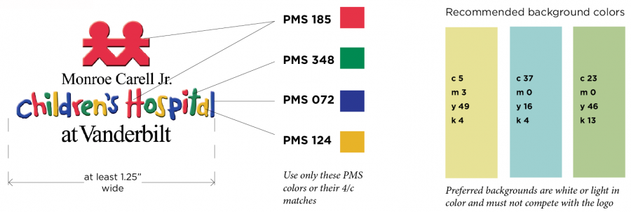
Colors
Full-color specifications are below. One- and two-color versions of the logo are also available.
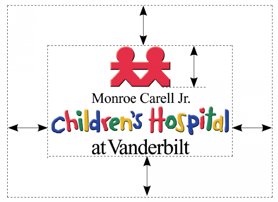
Minimum size and clear space
The logo may not be reproduced smaller than 1.25 inches wide from the outside of the C in Children’s to the L in Hospital. There must be clear space equal to the height of the paper dolls around the logo.
Stationery
All stationery requests should go through our Vanderbilt-approved print services supplier. Orders may be placed on their website.
Champ guidelines
Champ’s primary role is to support children’s safety and wellness. He may not be used in materials where he is treated as a logo or brand of the hospital. His image should never be used without the logo on the same page. Champ’s image is owned by Vanderbilt and should not be altered or recreated without permission. All materials using the hospital logo and/or Champ (brochures, flyers, booklets, promotional materials, etc.) must be approved prior to production.